Daisy and I are going to work together and I am combing my BSA206 project with the BSA227 class. Daisy said that she liked the story I came up with for BSA206 and she said she is happy to use that story which is:
A man is walking down a road nonchalantly. He steps in a puddle/pothole. Suddenly, he drops into it and lands in a florescent green, rolling meadow. Literally. The hills that he is standing on are moving like ocean waves. The man falls because he can't stand. When he hits the ground he becomes a cartoon of himself. The mountains continue to roll around him and eyes on stalks begin to grow out of the earth. The eye-plants sway with the hills and they all focus in on the man. The man looks at them in terror before trying to crawl away but as he does the camera focuses on a close up of the man's own eyes which have grown little hands and are trying to escape his head. The camera pulls out quickly and the cartoon man is now floating in space. He is spinning slowly through the atmosphere, he loses his cartoon-ness and his escaping eyes return to his head. Suddenly there is a hissing sound like air escaping a pressurized can. The man flies backwards really fast before slamming against a wall/the ground, back in the real world. He is shocked and confused and shakes his head wondering what just happened.
We discussed the genre and we thought that it would be a fantasy/adventure story.
We both agreed that the first and last shot would be done in live action, with the colour scheme quite desaturated to make it seem a bit bland, mundane and as if it is a normal day.
We think that the trippy part (where he falls into the other world) should be colourful, with bright colours and lots of overlayed images that make it seem like a supernatural, psychedelic world.
We intend for the clip to be a mix between rotoscoping and live action with 2D and 3D elements included.
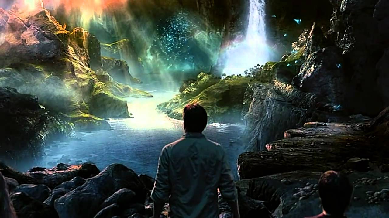
I like the colours used in the top left corner and I think we could overlay images to create a colourful, slightly ethereal-like atmosphere. I think oranges, yellows and pinks for the background lighting (as seen in the image) might make it more obvious that the world the character has landed in is much different from the world that we are used to as the light quality looks much different.
 I like the backgrounds in Tim Burtons Charlie and the Chocolate Factory because they are very bold, vibrant colours that contrast and so stand out. I think that for the moving mountains scene, bright greens and soft, curving lines would be nice. I don't think the design of the mountains should be overly detailed as I think that the most important bit would be the movement and I think if we add in neon veins that look like they are pumping colourful, magical blood beneath the mountains that will be enough detail as if we have too much on the mountains before that the veins won't look as obvious and it might not suit the simplistic 2D style of the rotoscoping.

For the space shot, I think that it should be quite colourful, and filled with stars. I think this shot would need a lot of layers of different atomospheric photos to make it seem to have depth. I think that these examples from The Hitchhikers guide to the Galaxy and Dr. Strange are good examples of images that show space as something magical and colourful, but also quite vast. I think we could try to make these using Photoshop to create different aspects, and then put them together. I think, for time reasons, we might have to simplify the shots slightly (in comparison to the two above), but I think if we get some nice images overlayed we should be able to achieve a nice looking backgrounds by creating images of dustparticales, stars and lighting effects and combining them.

I like the colour scheme of My Neighbour Totoro because it is very childlike, vibrant and fun. I think this would suit the cartoony scene quite well, However, for myself personally, I tend to like some darker colours also to add a more sinister aspect to even the most colourful parts. I think that, although the world the character lands in is quite vibrant and fun, the fact that it is also an unknown, alien place would mean that it needs to have some darker colours or atomospheric elements (like fog) to hint that it might not be an entirely friendly place.
I like the colours in The Secret of Kells because they are very vibrant and magical. They are similar to My Neighbour Totoro in that they are very bold but, from memory, The Secret of Kells is more atmospheric with fog and unusual light sources and compositions with make the world (especially outside the wall) seem alien and dangerous but also beautiful and magical. This is the kind of mood I am hoping to convey in the clip that we make.


Comments
Post a Comment